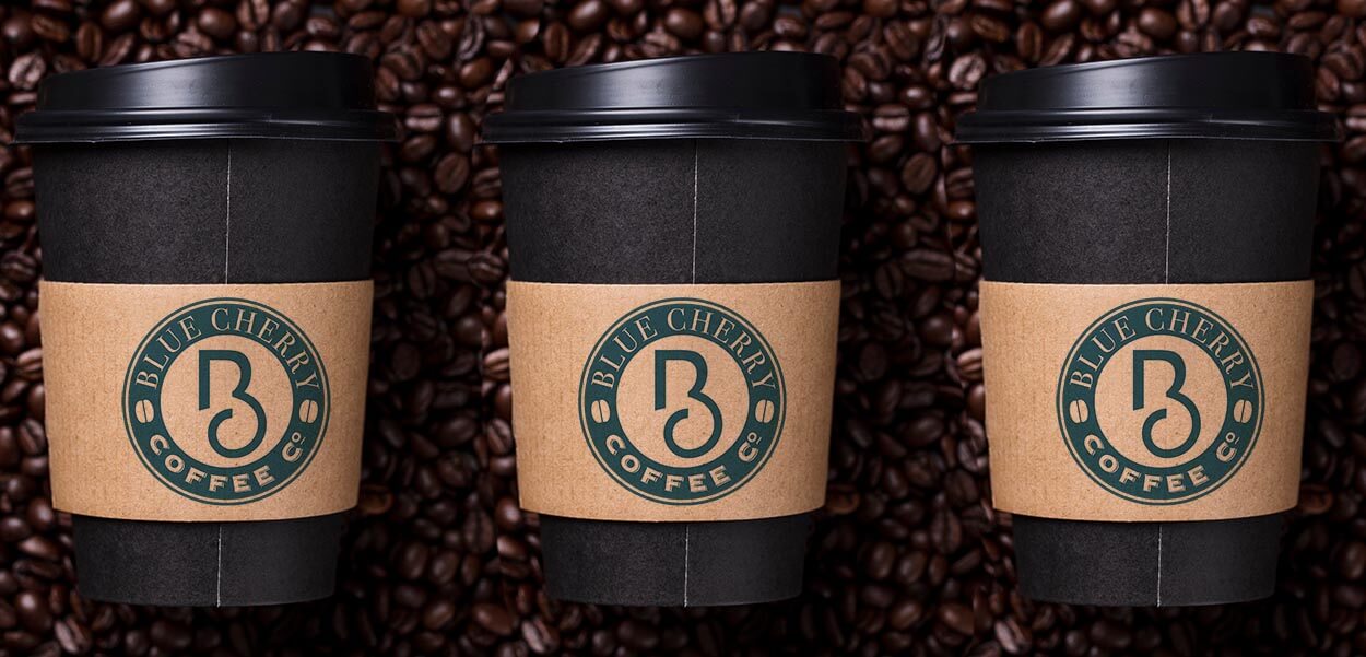
Coffee company new business identity
BLUE CHERRY COFFEE
The client had a very small budget, but still wanted a design that would be equal amongst competitors; be classy and distinctive; evoke tradition but with a slight modern touch, and work well in monotone.
Our approach was to explore the typographic relationships between the elements to create a distinctive and unique logo.
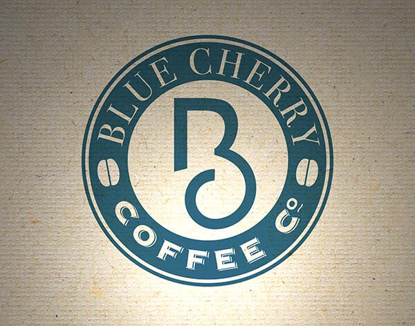
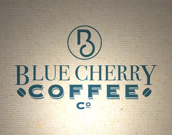
We explored the relationship between the B and C initials. Conventionally, they would seem awkward companions, with no obvious synergy . However, our logo design services and skills run deep and with a little exploration, we developed the distinctive combined B & C monogram to take centre stage within the logo.
We combined the elegant lines of the symbol with classic typography and balanced layout to create two versions (roundel and rectangular formats) for use in different marketing applications.


